The task
To create a logo for real estate investment company "OCTO". It works with third parties in Europe (primarily investments in Spain and Greece).
The logo should be stylish and neat. It should show an excellent all-inclusive service with transparent deadlines and processes.
Target audience: people with experience in investments, they value their time, mostly an entrepreneur with an average / above average income.
It is also important to reflect stability, confidence, but at the same time lightness in the logo.
The Solution
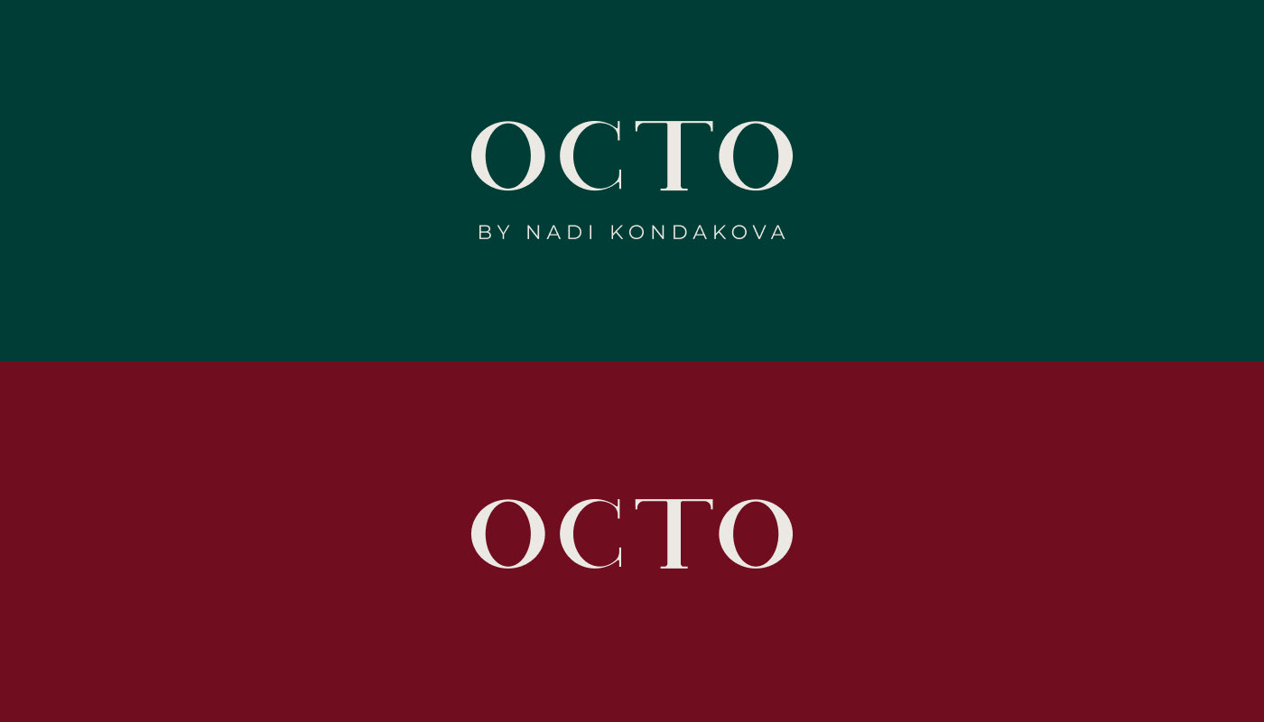
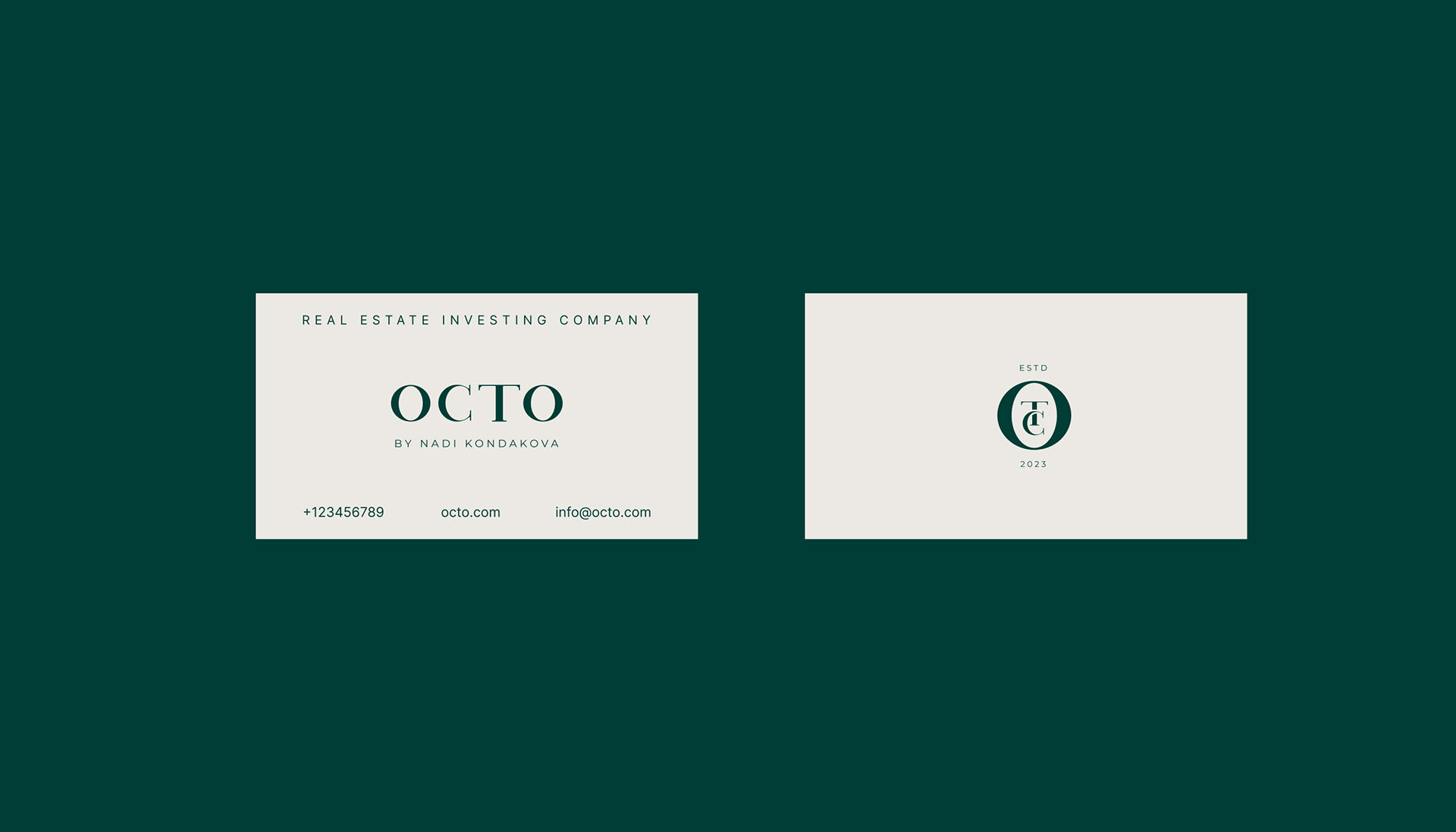
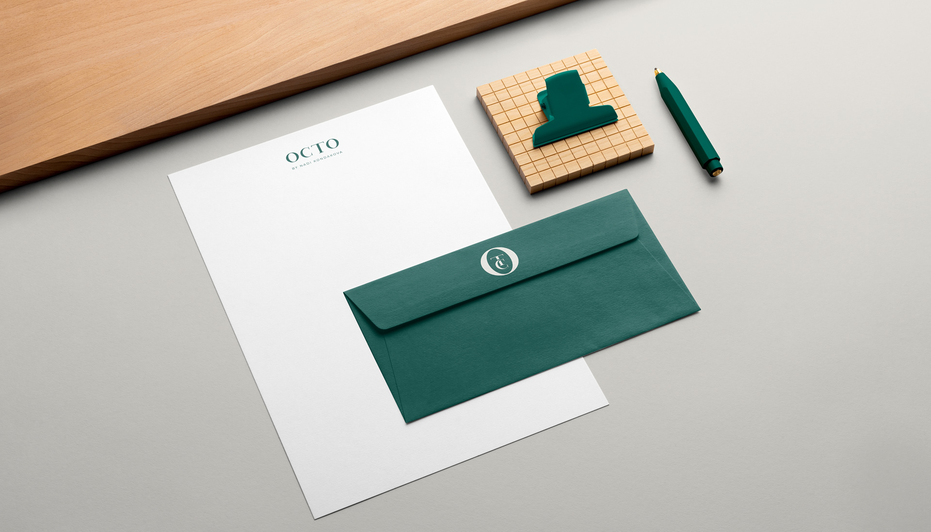
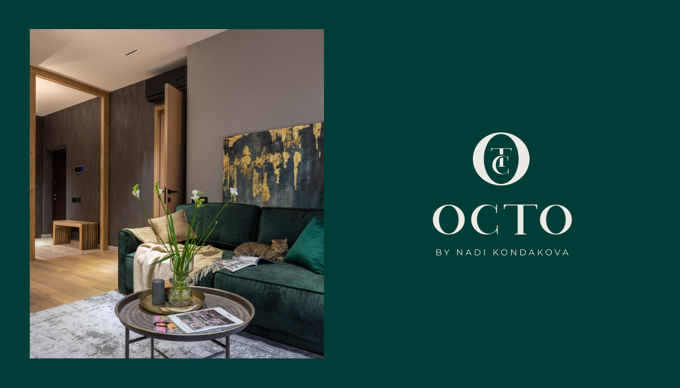
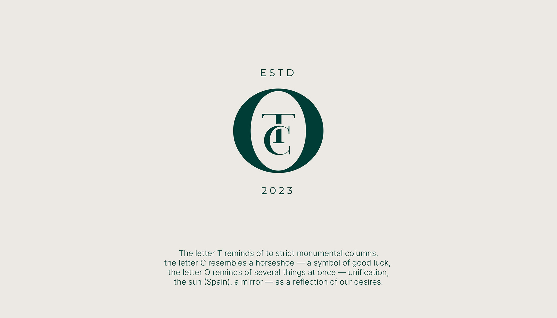
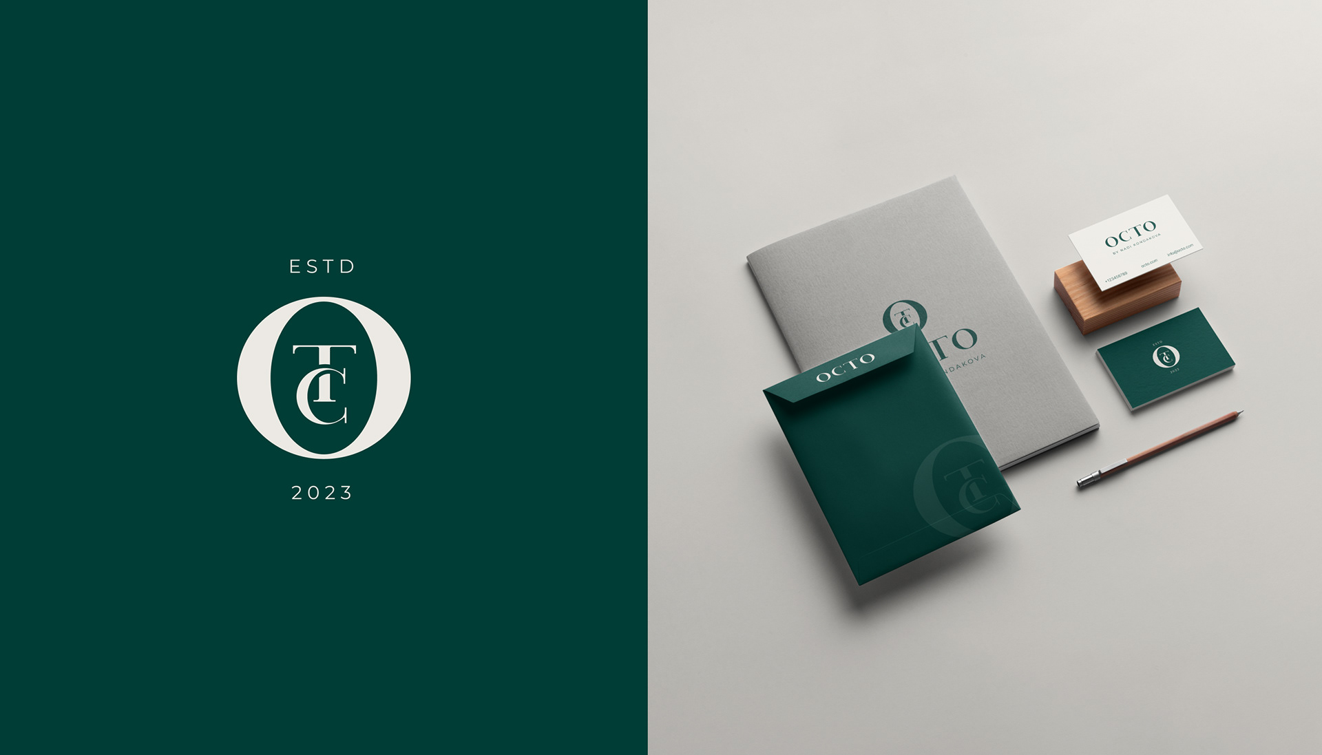
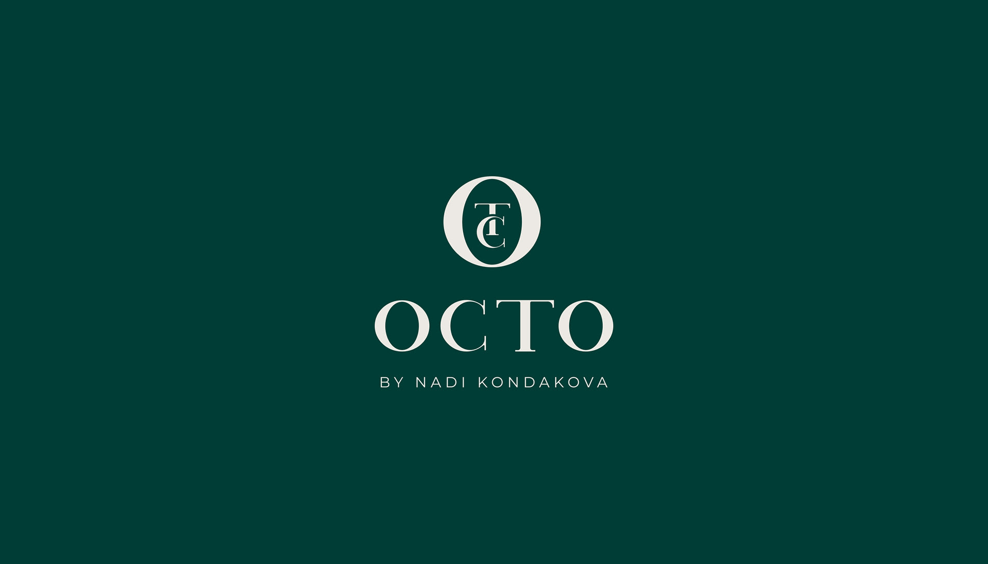
The logo looks stylish, elegant and laconic. The font for the word OCTO is hand-drawn and has a unique style.
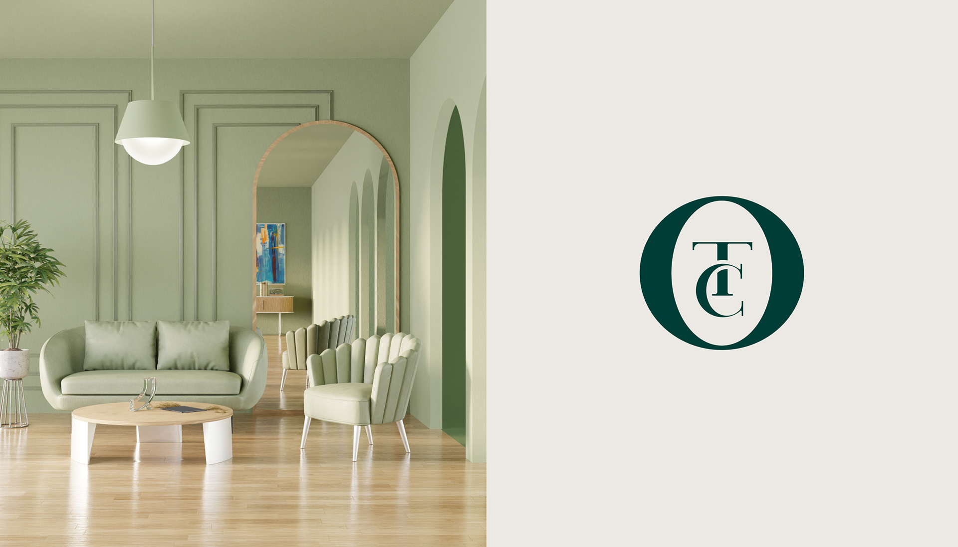
The brand symbol is a monogram of letters from the name. It is a strict and at the same time elegant sign that is easy to remember. The intertwined T and C float within the O. It create a feel of lightness. The rounded shape of the letter O makes the logo looks moderately friendly, while maintaining elegance.
The brand symbol is a monogram of letters from the name. It is a strict and at the same time elegant sign that is easy to remember. The intertwined T and C float within the O. It create a feel of lightness. The rounded shape of the letter O makes the logo looks moderately friendly, while maintaining elegance.
Contact me